When you think about coffee, the first name that comes to mind is Starbucks. Started in 1971, Starbucks is one of the biggest companies in the world. But what attracts most people is Starbucks’s unusual logo. You might not know, but the current logo isn’t the logo the company started with, it has been changed many times before. This begs the question, what is Starbucks logo history? In this blog, we will have a look at the logo evolution of the biggest coffee house in the world and the meaning of the Starbucks logo.
Table of Contents
A Brief History Of Starbucks
Before looking at Starbucks logo history, we first have to take a look at the company history. Coffee is a staple beverage in America, and at the time when Starbucks was founded, all the other coffee vendors were selling low-grade instant coffee to their customers. The three friends (founders of Starbucks), Gordon Bowker, Zev Siegl, and Jerry Baldwin, weren’t happy with this and wanted to do better. They started their coffee business from a basement in Seattle and started offering coffee, Tea and spices. Initially, the name of the start-up was not Starbucks, but Pequod, after the ship featured in the story of Moby Dick. However, they quickly renamed it to Starbucks, based on the name of the chief mate in Moby Dick. Then, in 1987, the company was sold to Howard Schultz, who took the company to new heights. Currently, Mellody Hobson is the chairwoman of the company, and the CEO of the company, Laxman Narasimhan, is of Indian origin.
Starbucks Logo History
The logo of Starbucks has been changed a few times in the past. So, let’s get right to it. Here are the different logos of Starbucks.
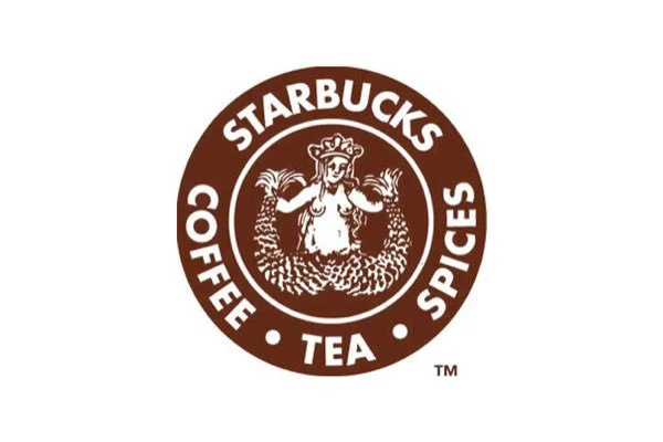
1- 1971 to 1987
When talking about Starbucks’ logo history, we have to start with the very first Starbucks logo. Initially, the company’s logo wasn’t green but brown. More importantly, the logo had ‘Starbucks Coffee, Tea, Spices’ written on it. As we mentioned above that the company was named after the Chief Mate in Moby Dick, this naval theme was watered down to the image they used in the logo. They used a two-tailed mermaid with exposed breasts and a crown on her head for the logo, which was based on Greek Mythology where these mermaids are called Sirens.
2- 1987 To 1992
After being sold to Howard Schultz in 1987, he immediately hired an artist by the name of Terry Heckler to give the next logo in Starbucks logo history. To signify a brand new start, Heckler made some major changes in the log. For starters, the colour of the logo was changed from brown to kelly green to represent a new start of the company. Moreover, some changes were made to the mermaid as well, her breasts were covered by her hair, she was made more streamlined and smooth and her crown was also changed. New wordmarks were also added, the old ‘Starbucks Coffee, Tea, Spices’ was removed and ‘Starbucks Cofee’ was added with 2 stars joining the words.
3- 1992 To 2008
The third logo in Starbucks logo history came in 1992. Not much was changed this time except a few little things. The mermaid was a little zoomed-in, creating a more intimate view. Also, only the top part of the mermaid’s tail was visible now, and the rest was hidden behind the text and the concentric circles. The font was also sharpened a bit to give it a more modern look. In short, the mermaid was given even more emphasis this time around.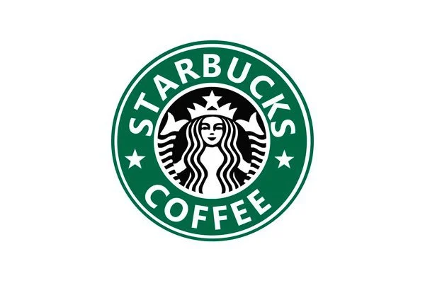
4- 2008 To 2011
The 4th logo in Starbucks logo history came in 2008 and this was a homage to the original logo, celebrating the 40th anniversary of the company. The designers reimagined the logo and gave it a few tweaks. Firstly, the logo colour was not green or brown, but black. The old mermaid design was also brought back. However, this is when the company learned a few lessons about branding and logo as people thrashed the company because of the new logo. Their green logo had become so iconic that the customers wouldn’t accept anything other than their previous logo. 
5- 2011 To Present
After facing extreme backlash from its customers, the company decided to launch the 5th logo in Starbucks logo history. This time around, the company approached a modern design philosophy while making the logo. For starters, the text and the concentric circles were removed and the zoomed-in mermaid was given the centre stage. The eyes, nose and hair of the mermaid were redesigned to be more symmetrical, and the kelly green colour scheme was back. This logo was made to be more modern and easily relatable to the people. This was the final rendition in Starbucks logo history.
What Is The Meaning Of Starbucks Logo?
Now that we’ve seen the logo evolution of Starbucks, many people might wonder, why use the mermaid? What is the meaning of the Starbucks logo mermaid? Well, as we mentioned above, the mermaid was taken from Greek Mythology. In Greek mythology, these mermaids were called Sirens, and these Sirens were used to lure sailors with their beauty into crashing their ships on the coast of a small island. The Starbucks logo also does the same, but instead of luring its customers to crash their ships, Starbucks lure them into drinking the best coffee in the world. This is the meaning of the Starbucks Logo.
Our Take
Starbucks logo history shows us how important a logo is to a company and its customers. After seeing the logo evolution of Starbucks from the first logo to the present, we can see how much the company has truly changed. Moreover, the constant refurbing of the logo shows that the company is always striving to be better. We hope this blog was informative and you enjoyed reading the blog.